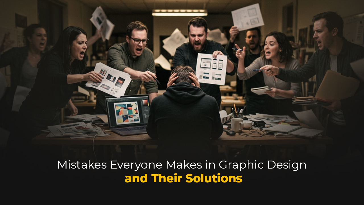
When a design is bad, it's usually easy to say why. But when a design is "almost good," that's when you've entered dangerous waters. Because that design gets approved, published, added to a portfolio, and the problem becomes completely invisible. The biggest mistakes graphic designers make usually don't stem from a lack of technical skill — they come from habitual blind spots, process shortcuts, and the kind of weaknesses no one ever says to your face. This article was written to name those blind spots.
The Difference Between Reading a Brief and Understanding It
The vast majority of designers read the brief. Few truly understand it.
Reading a brief is a passive act: you skim the words, note the deadline, maybe jot down the dimensions. Understanding a brief is an active investigation. It means asking questions like "Why does the client want this?", "Whose life will this design touch?", "What is the real problem?"
The most common mistake starts here: the designer does what the client said, not what the client wanted. These two things are often different.
A good brief process requires this: write your own questions before talking to the client. Ask not just about the product, but about the target audience, the competitors, the success criteria, and the things the client hasn't tried yet. The more clearly the brief is understood, the lower the revision count.
Disrespecting Typography
Typography is the silent voice of design. And most designers don't listen to that voice carefully enough.
The most frequently seen typographic mistakes are:
Lack of hierarchy: When a headline, subheading, body text, and caption all appear with the same visual weight, the reader's eye doesn't know where to go. Typographic hierarchy is not a luxury — it is communication itself.
Wrong font pairings: Placing two serif fonts side by side is problematic not because they are two similar characters, but because the tension between them becomes illegible. Font pairing is not a matter of feeling; it is a matter of contrast and harmony.
Neglecting line length: A readable line length is generally between 45–75 characters. Going outside this range — lines that are too short or too long — breaks the reading experience. Most designers know this rule but never test it on screen.
Confusing Tracking and Kerning: Tracking affects all the text; Kerning adjusts the spacing between specific letter pairs. Not manually adjusting Kerning when using display-size fonts is a visual carelessness.
Typography mistakes take time to notice because the eye grows numb over time. The simplest remedy: flip your work upside down, look at it from a distance, or open it the next day.
Approaching Color Emotionally Rather Than Systematically
"I like this color" is not a valid reason for a color decision.
Color selection is a systematic process. It begins by looking at brand identity, target audience, the technical constraints of the platform, and the color language of competing brands. After that, you test contrast, accessibility (WCAG standards), and how colors influence one another.
Common color mistakes designers fall into:
- Keeping the color palette too wide
Five or more primary colors generally creates complexity. Good brands have one dominant primary color, one or two supporting colors, and a neutral tone system.
- Ignoring accessibility
Approximately 300 million people worldwide experience color blindness. The contrast ratio between text and background must be at least 4.5:1 (WCAG AA standard). This is not a technical detail — it is an ethical responsibility.
- Confusing screen and print color
The transition from RGB to CMYK changes color. A color approved with the client on screen coming out differently in print is a classic crisis, and it is preventable.
Lack of Confidence in White Space
The most distinguishing common trait of inexperienced designers: the urge to fill everything.
White space is not weakness. White space is the breath of design; it reinforces hierarchy, guides the eye, and separates elements from one another. Think of Apple's advertisements, Dieter Rams's product designs, or the Swiss design tradition: their power comes largely from the courage to use white space.
Designs where white space is underused look cluttered; they even feel like the information density is high, even when the content is sparse. The reader gets confused about where to look and turns away from the design.
Practical Rule: After finishing a design, remove one element. If the design improved, that element was already redundant. If it didn't improve, put it back.
Using the Grid System Like a Template
A grid is not a prison — it is infrastructure.
Producing design without a grid system is an invitation to randomness. But applying the grid like a rigid cage equally kills the design.
Common mistakes in grid usage:
Ignoring the grid:
Especially in digital environments, aligning elements by eye leads to inconsistent spacing. This inconsistency becomes even more pronounced on small screens or at different resolutions.
Applying the grid like a template:
Forcing every element into grid columns kills dynamism. Some elements breaking the grid is a deliberate choice made by a designer who understands the grid — not an accident, but a preference that comes from experience.
Leaving the grid decision to the last minute:
The grid decision is one that must be made at the beginning of the design process. A grid problem dismissed with "I'll fix it later" turns into hours of lost time on delivery day.
Designing to Please Designers Rather Than the Client
This is perhaps the most important and least discussed mistake.
Designers see design. In a year they evaluate dozens, hundreds of pieces, follow trends, study award-winning work. This experience is valuable but has a dangerous side effect: the designer's taste and the target audience's needs gradually diverge.
A brand identity design may earn applause in the design community while never connecting with the client's target audience. A packaging design may be featured on Behance while remaining invisible on a shelf.
The purpose of design is always communication, not exhibition. Being able to say "I don't personally find this beautiful, but it's right for the target audience" is a mark of maturity.
The ways to test this are simple: Show the design to people who resemble the target audience and ask how they interpret it. Study competitors' visual language and know where you're positioning yourself. Run A/B tests.
Viewing Revision as Outside the Process
The sentence "they requested a revision" creates a small disappointment in the inner world of most designers. This perspective is the problem.
Revision is not a part of the process — it is the process itself. The more clearly the brief is defined, the lower the revision count, but it never reaches zero. The client doesn't fully know what they want until they see the design; this is a fact, and a professional designer accepts it from the start.
Common mistakes around revision:
Taking revision personally:
The client is not asking you to change the design; they are trying to express their own need more clearly.
Receiving revision verbally:
Every revision request must be in writing — email, message, or brief update. A design process built on "they said such-and-such at that meeting" produces ambiguity.
Accepting unlimited revisions:
If the number of revisions isn't written into the contract, scope creep is inevitable. This is a business rules problem and it is the designer's responsibility.
File Organization and Delivery Standards
When the design is finished, the work is not done.
File organization is a discipline, and most designers think they can learn it whenever they want to — until the first major crisis.
The most frequently seen file and delivery mistakes:
- Not naming layers:
Six months later, no one will know what a layer named "Layer 47" contains — including yourself. That's why, while working on a design, giving each layer a name that describes what it is — as much as possible — will incredibly speed you up on multi-layered projects and prevent you from getting stressed.
- Not embedding fonts or converting to Outlines:
The fonts in the project may not be on the team or client's system. This detail, which seems minor, can turn into serious problems in the workflow when mishandled.
There are two scenarios and each has a different solution:
If you are sending the file to print yourself, you must convert all text to Outlines. A file not converted to Outlines may open at the print shop's system with a different font or with incorrect characters, and you will usually notice this mistake after the print has already come out.
If the client will deliver the file, or if someone else will touch this project in the future, add the font files inside the project folder. Two years after you've closed this project, the client may need to move it to an agency or transfer it to their internal team for an update. If the fonts aren't in the folder at that moment, the visual integrity breaks and the source of the problem becomes you — even if you're not there anymore.
- Not doing version control:
The naming hierarchy of "Final", "Final_v2", "Final_REAL_LAST" becomes the nightmare of a design studio. Date-based naming (YYYY-MM-DD) or a version control system (v1, v2, v3…) solves this problem.
Delivering only the "design" format:
Delivering a .ai or .psd file to the client is often not sufficient. It must be clarified upfront in which formats, at what resolution, and in which color profile the deliverables will be provided.
Refusing Feedback - or Accepting Every Piece of Feedback:
Both are equally dangerous.
Defending every design decision, perceiving feedback as a personal attack; these are serious obstacles to a designer's professional growth. On the other hand, applying every piece of feedback without questioning also turns the designer into an order-taker.
The right questions to ask when receiving feedback are: "Why are you requesting this change?", "What problem are you hoping to solve with this change?" These questions are not defensive — they are curiosity. And they most often reveal the underlying real need, which can be addressed through a different solution than what the client proposed.
Confusing Trend With Design Philosophy
Every year a new visual language emerges. Flat, Blobs, Brutalism, Glassmorphism, 3D fluid forms… Following trends is part of cultural literacy, but confusing trend with design philosophy is dangerous.
Using a trend is legitimate if it fits the client's brand, aligns with the target audience's visual expectations, and there is a functional reason for it.
Using a trend is problematic if it is used only because "this is fashionable right now." A design like this will look dated two years later.
Lasting design philosophy is built on timeless principles: hierarchy, contrast, balance, rhythm, unity. A designer who has internalized these uses trend as a tool — they don't become a slave to it.
A BRIEF NOTE
The reason I wanted to write about this topic is this: I made every single one of these mistakes myself.
There were periods when I misunderstood the brief, solved typography by eye, and produced work meant to please a jury member rather than the client. These were inexperience mistakes — but they didn't go away on their own as I gained experience.
I wrote this article to bring out into the open the things design school curricula don't teach but that you feel inside the studio. Technical knowledge can be learned. But habitual perspectives, the way you read a brief, your reaction to feedback, file organization… these settle in silently, and most of the time no one says it to your face.
This article is what someone needs to say to your face.
DID YOU KNOW? — 8 QUESTIONS 8 ANSWERS
1. Why is the sentence "The client liked it, the job is done" dangerous?
Because the client's approval and the design actually working are not the same thing. The client may love the color, but that color may not be speaking to the target audience at all. The final judge of a design is not the person who approved it — it is the people the design is supposed to reach.
2. What exactly is "over-designed" in the industry?
An over-designed piece is work that tries to prove the designer's existence rather than solving the problem. Too many fonts, too many colors, too many effects — all of these can be signs of insecurity. The best design is often the invisible one; it works so seamlessly in the background that the user doesn't even notice it.
3. Why do designers take revision personally?
Because producing design requires intellectual and emotional labor. Having a decision rejected can feel like that labor is being rejected. But the client is usually not trying to re-express the design — they're trying to re-express their need. Grasping this distinction is one of the cornerstones of professionalism.
4. Why do junior designers tend to add more elements?
Confidence in white space comes with experience. For new designers, leaving few elements on a page can create the feeling of "I haven't worked enough." Yet reducing is a far more difficult decision than adding, and it generally yields stronger results.
5. Can an entire industry be making the same mistake?
Yes, and this is called "cultural blindness." When all designs in an industry start to look alike, no one stands out — because everyone is following the trend. The most successful brands are those that have made visual decisions that deliberately break industry norms.
6. Why is the issue of font licensing so often skipped?
Because designers frequently use fonts they downloaded for personal use in commercial projects without realizing it. Font licenses vary by type of use (web, print, app, broadcast). Using a font without a license creates legal risk — for both the designer and the client.
7. Why does "delivering a design without sleeping on it" cause quality problems?
The eye grows numb when looking at the same piece for a long time. It no longer sees typos, proportion issues, or color inconsistencies. Leaving a design for at least one night and looking at it with fresh eyes catches far more mistakes than working on it for hours.
8. Why do designers struggle to put their own work in their portfolio?
Because every piece of work is the product of both a process and a constraint. Client decisions, budget, time, brief changes… The ideal portfolio is not made up of perfect work — it is made up of work that clearly articulates the decision-making process. A portfolio that answers not "what did I do" but "why did I make this decision" is far more powerful.