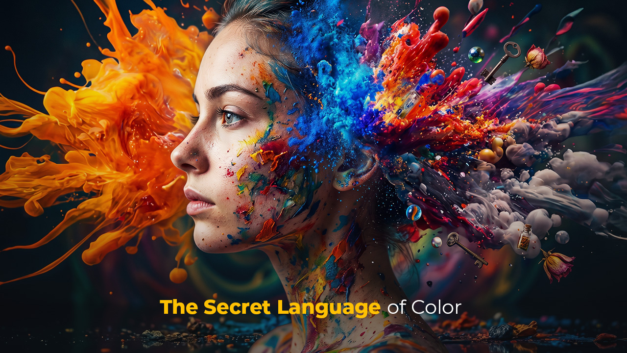
There are marketers who changed the color of a product and increased sales by thirty percent. There are architects who painted hospital corridors in specific shades and accelerated patients' recovery processes. There are colors that keep you on a website longer, make you trust a brand, and even make you feel hungry — and you experience none of this consciously. Color psychology is the most powerful and least discussed layer of visual culture. In this article, we will discuss how color works, why it leaves such a deep impression, and how you, as a designer, can use this knowledge authentically.
Color Is Not an Aesthetic Preference — It Is a Neurological Event
Most people think of color as a matter of taste. "I love yellow," "gray feels cold," "navy is my favorite color" — these all seem like personal interpretations. But brain imaging studies tell a different story.
When the eyes perceive color, the signal travels from the retina to the visual cortex, and from there to the limbic system — the center of emotional processing. This process is completed before conscious thought. In other words, by the time your brain produces an emotional response to a color, you haven't even asked yourself the question "how should I interpret this color?" yet.
This neurological reality takes color psychology out of the realm of intuitive preference and moves it into a measurable domain of influence. And that is why color decisions — for a logo, a product package, a website background — are never purely aesthetic.
Every Color Has an Emotional Map
Knowing the difference between the universal and cultural meanings of colors is the most critical distinction in this field. Some responses are biological in origin and independent of geography. Others are entirely learned and culturally conditioned.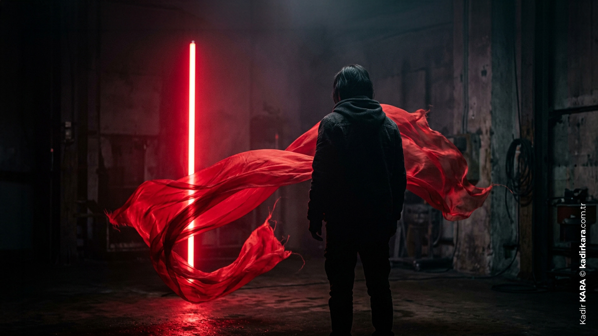
Red: Urgency, Power, and Danger
Red is one of the few colors that triggers an adrenaline response in humans. Laboratory studies have shown that it increases heart rate and extends perceived duration of time. That is why discount labels are red — it creates a sense of urgency. That is why stop signs are red — the danger warning is universal. That is why fast food chains love red — it stimulates appetite and increases customer turnover rate.
Design note: When misused, red becomes aggressive and exhausting. As an accent color it is powerful; as a dominant color it depletes.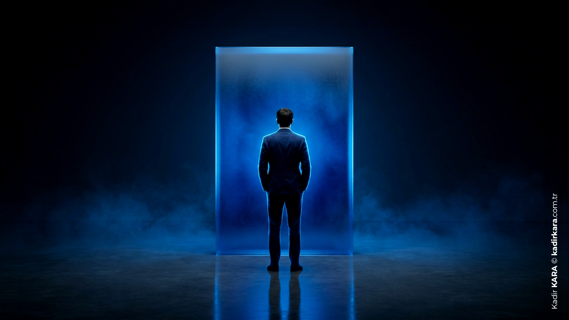
Blue: Trust, Depth, and Control
Blue consistently tops "most liked color" surveys worldwide, and this is no coincidence. Blue sky, calm water: we have an evolutionary connection to these images. Blue is associated with conditions where cortisol-linked stress decreases and the sense of trust increases.
This is why the vast majority of technology and finance brands use blue. Facebook, PayPal, Samsung, IBM, Ford… they are selling trust, and their colors say the same. The dominance of blue and turquoise tones in hospital environments is not a coincidence — it is a deliberate environmental psychology decision.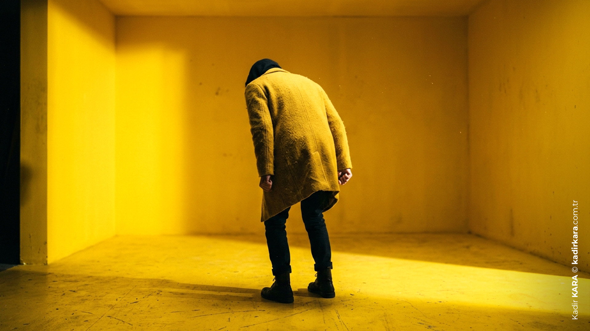
Yellow: Attention, Energy, and Fatigue
Yellow is the color the human eye processes most quickly. This is why it is used on warning signs. In small doses it attracts attention and provides energy; in high doses it triggers anxiety. There are studies showing that subjects who spent extended time in a fully yellow room showed increased aggression levels.
In design, yellow is excellent as an accent; as a dominant color it is risky. It causes eye fatigue especially on bright screens.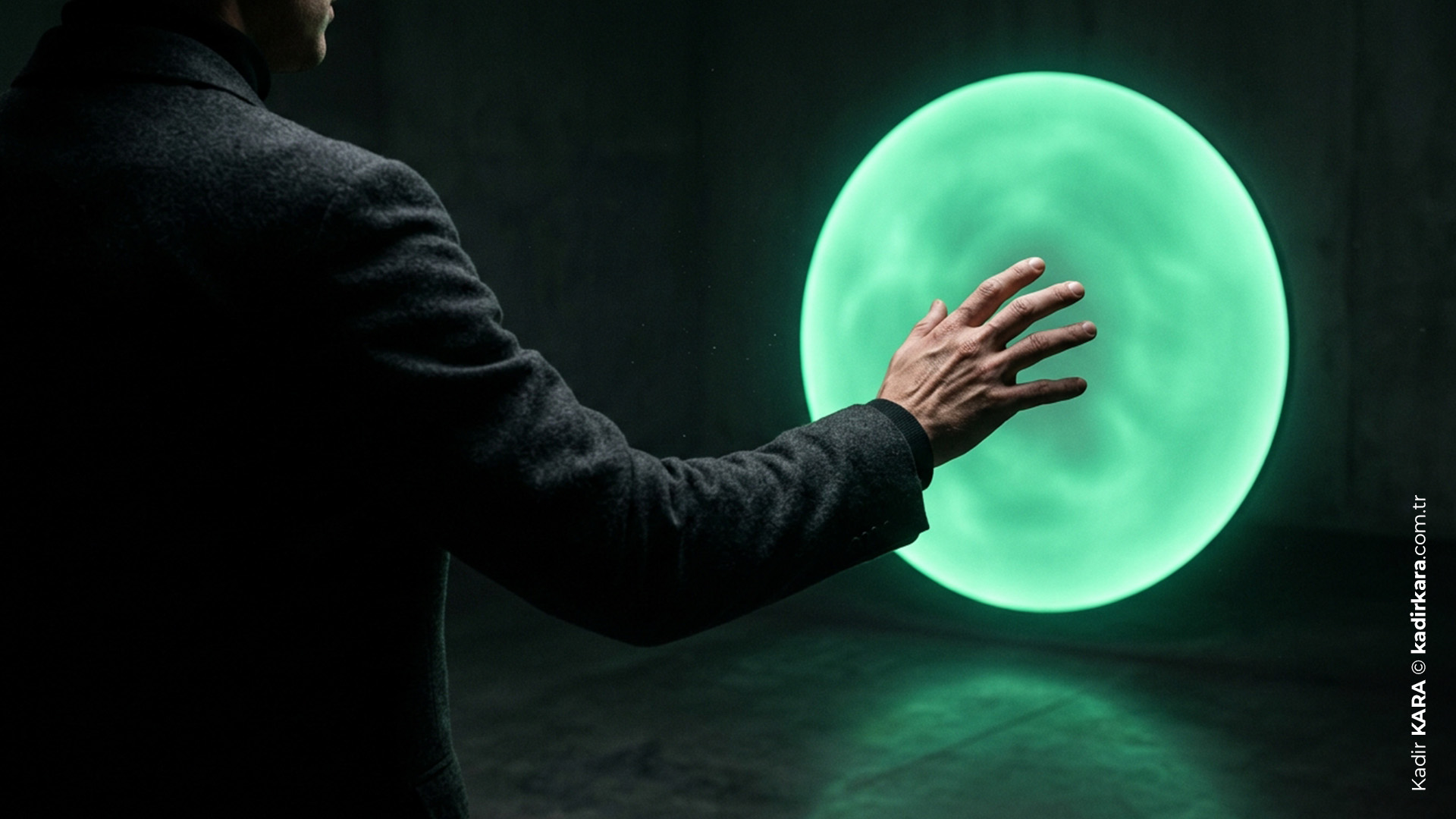
Green: Balance, Naturalness, and Permission
Green is the most common color in nature, and that is why our eyes experience a physiological relaxation when looking at it. Health, organic living, environment… brands in these categories feel almost compelled to use green. But green has another power: the "proceed" signal. From traffic lights to approval buttons, green gives permission.
Behind the practice of making "call to action" buttons green in UX design lies this subconscious approval reflex.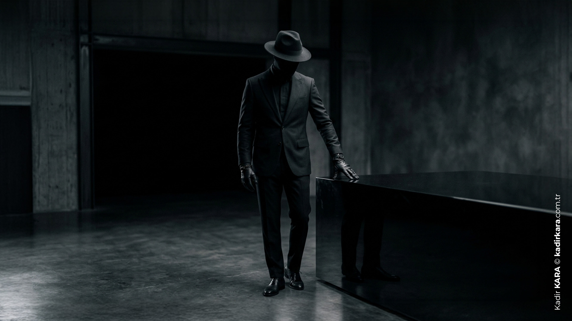
Black: Prestige, Mystery, and Weight
Black is indispensable for luxury brands. Chanel, Apple, Rolex, Louis Vuitton… these brands that create a premium perception benefit from the weight of black. Black is psychologically associated with control, sophistication, and authority.
But like every color, black carries different meanings from culture to culture. This connection made with mourning and death in the West is not universal; in Turkey, black is used as the color of mourning, and this is an ordinary cultural reflex for us. Yet in many Asian cultures the picture is reversed: mourning is observed with white. It is not that Asian countries do not use black at all, but in the general cultural memory of the region, white takes on this function.
Therefore, while concluding that "black means power and prestige" for a brand, the same palette can open the door to an entirely different emotion in a different geography. The more weight a color carries in the global language, the more costly it can be to fail to read its local context.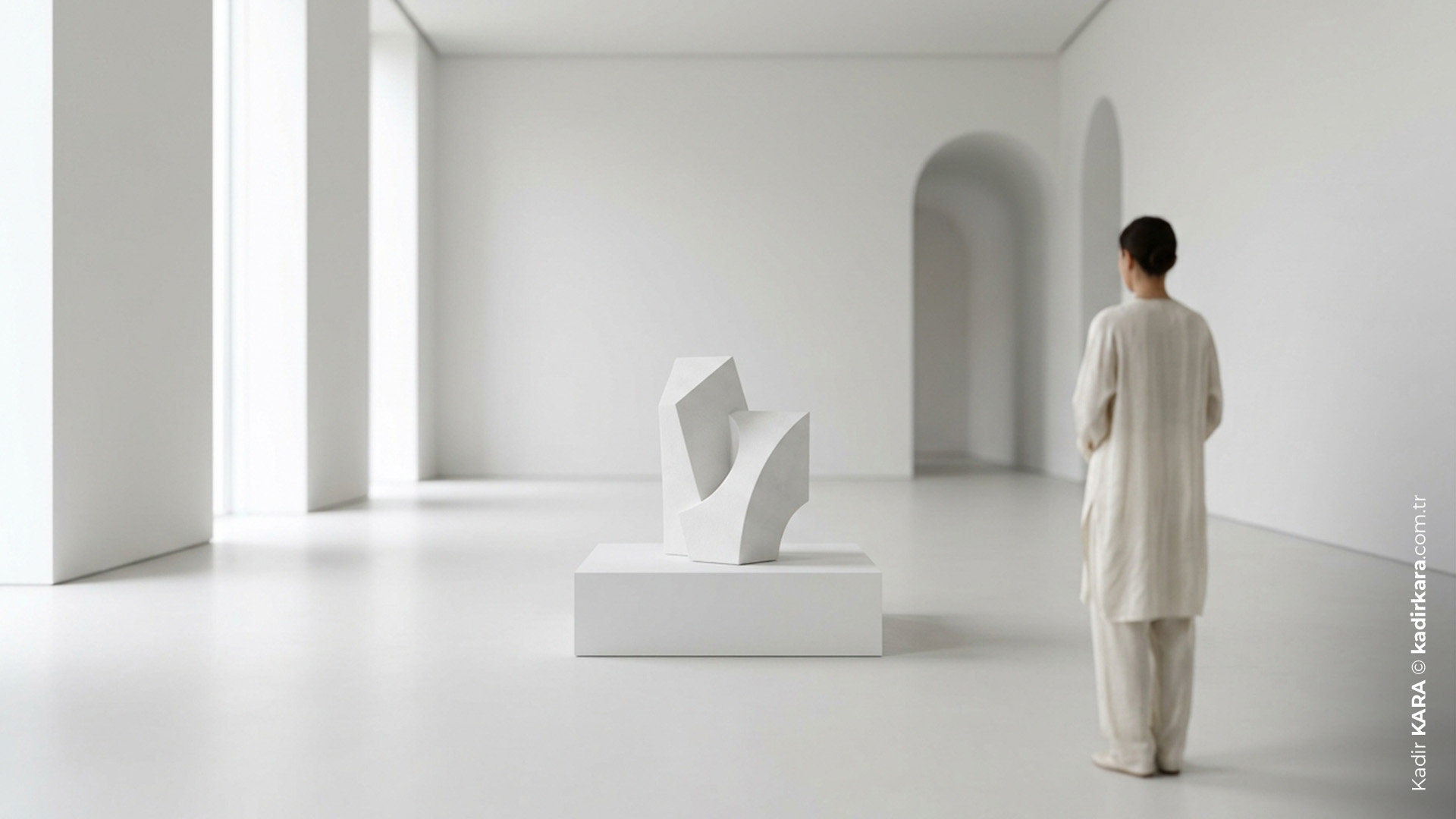
White: Clarity, Minimalism, and Space
White in Western culture is synonymous with cleanliness, novelty, and purity. The dominance of white in Apple's product design and packaging visually reinforces the brand's message that "simplicity = high quality." Negative space in design is most often white or light-colored — it allows the content to breathe and increases readability.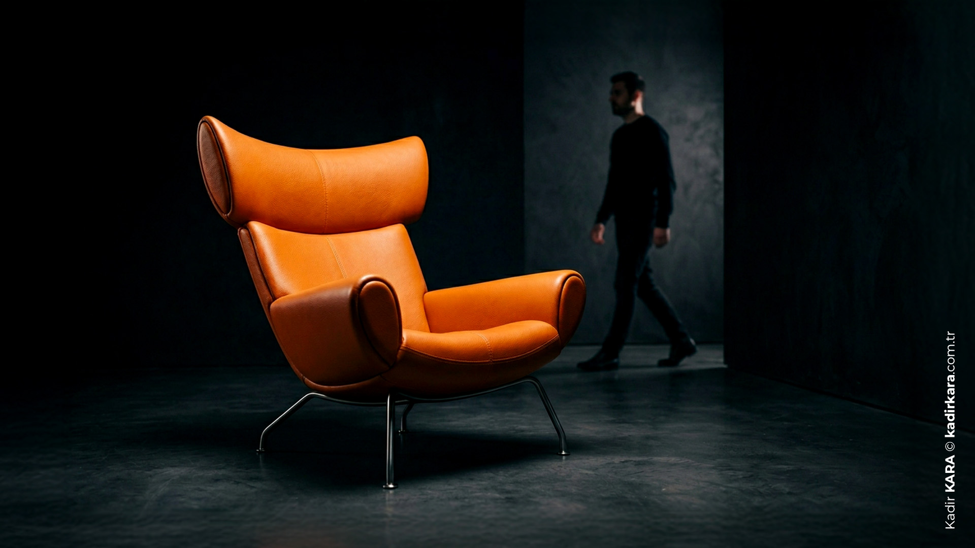
Orange: Accessibility, Warmth, and Energetic Sincerity
Orange combines the urgency of red with the attention-grabbing quality of yellow, but softens the harshness of both. Amazon's use of orange is intended to build a brand perception that is accessible, warm, and energetic. Harley Davidson's orange and black combination resolves the message of freedom and power at the level of color.
Cultural Breaking Points in Color Psychology
We have spoken of universal biological responses. But the real danger for designers is here: the same color can carry opposite meanings in different cultures.
White: purity and weddings in the West; mourning and death in many East Asian cultures.
Green: sacred and abundance in the Middle East; associated with death in some Latin American countries.
Purple: royalty and luxury in Europe; mourning in Brazil and Thailand.
Yellow: energy and attention in the West; jealousy in France; courage in Japan.
"When making a color decision for a global brand, it is essential to research the cultural color codes of the target market. The cost of skipping this research can go beyond a mere aesthetic mistake all the way to a complete communication breakdown."
Using Color Psychology Correctly in Design
Color: Strategy First, Aesthetics Second
When choosing a color palette for a brand, the first question should not be "which one looks beautiful?" but rather "what does this color make you feel, and does that feeling align with my brand's promise?"
Using vivid yellow in a law firm's logo may not be aesthetically wrong, but it completely undermines the message of judgment, credibility, and authority.
Color Hierarchy: The 60-30-10 Rule
Widely used in interior design and graphic design as a practical color psychology framework, this rule works as follows: the dominant color makes up 60% of the composition, the secondary color 30%, and the accent color 10%. This ratio is aligned with the eye's natural scanning behavior and reduces visual fatigue.
Contrast and Accessibility
Color psychology means not only emotional impact but also readability and accessibility. According to WCAG (Web Content Accessibility Guidelines) standards, designs that lack sufficient contrast ratio between text and background are problematic both in terms of accessibility and SEO.
Color and Conversion Rate
A/B tests consistently show that the color of CTA (call-to-action) buttons directly affects conversion rate. But there are no universal rules such as "green is always better than red" or "an orange button increases click-through rate." Color impact is contextual; it varies with the page color palette, target audience, and brand identity.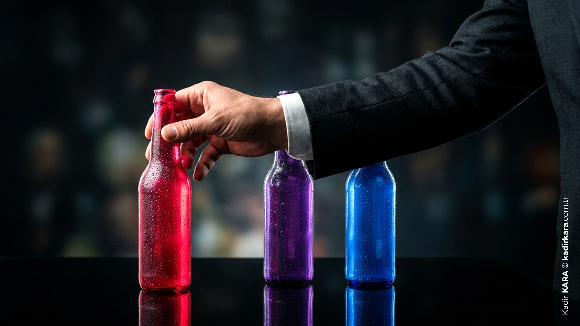
Color Psychology and Brand Identity: Recognition Lives Inside Color
Research shows that when consumers first see a brand, they recognize the color far more quickly than the shape of the logo. Color is the fastest-processed identity component of a brand.
That is why Coca-Cola has "claimed" red. When competitors approach the same shade, a sense of violation is already formed in the consumer's mind; perception has long been established before any registration. The beverage industry is one of the arenas where this ownership battle is most clearly visible; Sprite has claimed green, Fanta yellow, Pepsi blue. Each has used that color so consistently and over such a long period that the color now carries an identity independent of the product itself; you see the color before you see the packaging on the shelf, and the brain fills in the rest.
Cadbury went one step further and fought lengthy legal battles in England over the color purple. Because when used correctly, color transforms into not merely an aesthetic preference but a commercial asset.
For a brand, color selection is not merely an aesthetic choice - it is a strategic ownership decision.
Color Psychology in UI/UX Design: The Unique Rules of the Digital Environment
Color behavior on digital screens differs from physical print. When working with RGB light mixing, saturation and brightness produce different responses than physical color pigments.
Dark Mode: Dark interfaces can reduce eye fatigue, but this does not hold true for every user. Research shows that dark mode is beneficial in low-light environments, while light mode is more readable in high-light environments.
Color and Emotional State Management: The fact that most meditation applications prefer blue and purple tones, fitness applications orange and red, and finance applications navy blue and green — all of these are conscious applications of color psychology.
Color in Micro-Interactions: An error message being red and a success notification being green meets expectations. Breaking this expectation (for example, a red "congratulations" notification) creates instant confusion in the user, and this confusion turns into a loss of trust.
A BRIEF NOTE
For years I saw color psychology as "soft knowledge." When I read sentences in a brief that said "red gives energy, blue builds trust," I would pass by them internally saying "yeah, yeah." Then I observed how color decisions actually worked in real projects. Why clients reacted instantly to some designs, why they said about some logos "something is wrong but I don't know what." The answer was most often in the color.
The reason I wanted to write this article is this: color psychology is either covered too superficially in design curricula, or it gets lost inside an academic list. Yet when you truly internalize this knowledge, both the way you read a brief and the way you discuss color with a client change. You can now say "this color does not support this message" in response to the argument "I liked this color," and you can defend this with concrete justification.
This difference is one of the most distinguishing things that sets a senior designer apart from an ordinary designer.
DID YOU KNOW? - 8 QUESTIONS, 8 ANSWERS
1. Does a color-blind person feel the emotional impact of color in the same way as others?
No, but the difference is not as large as we might think. Even though color-blind individuals cannot distinguish colors, their responses to brightness, saturation, and contrast are largely preserved. Since the emotional impact originates not only from color hue but also from these variables, color-blind individuals also receive a significant portion of the benefits of color psychology.
2. Is "My favorite color gives away my personality" true?
Partly. There are studies on the relationship between personality and color, but most correlations are weak and mixed with cultural factors. Simplifications like "people who love blue are trustworthy" do not have a solid scientific basis. Color preference is shaped as much by cultural exposure as by personality.
3. Why does the same color look different in physical print and on a digital screen?
Print works with CMYK (Pigment Mixing), screen works with RGB (Light Mixing) systems. These two systems produce color in fundamentally different ways. The Pantone color system was developed to fill this gap. It has become a global standard for the purpose of ensuring color consistency between physical and digital environments.
4. Why are red and orange most commonly used in restaurants?
These two colors are consciously preferred in restaurant design because they stimulate appetite and shorten perceived waiting time. The color choices of fast food chains are not entirely coincidental. They are calculated decisions aimed at increasing customer turnover rate and order volume.
5. Why is blue used by so many technology brands?
Blue is one of the few colors that carries associations of trust, competence, and stability. Since technology companies are platforms to which users entrust their data, identities, and money, conveying a message of "trust" is a strategic necessity. Blue is the color that most efficiently conveys this message at the visual level.
6. Why do designers frequently overlook color-blind users?
Because design tools produce full-color visuals by default and the designer checks through their own eyes. Color blindness simulation tools are most often used at the end of the process or not at all. Yet approximately 8% of the male population experiences red-green color blindness; this is an audience size the designer cannot ignore.
7. Is it legally possible to "own" a color?
Under certain conditions, yes; but this process is far more complicated than one might think. Cadbury's story is the most striking example of this. The brand obtained trademark protection in England for the shade of purple it used on chocolate packaging for decades. Rival Nestlé challenged this decision and the case went on for years. Courts at times produced decisions in Cadbury's favor, and at other times against it. The outcome got lost in a legal process too layered to be summarized in a single sentence.
So when does registration become possible? It needs to be proven that the color has established a strong and long-lasting relationship with a specific brand. Meaning you first claim ownership in perception, then you defend it in court. And the second step does not always end as definitively as the first.
8. Is there a connection between blank page anxiety (Blank Page Anxiety) and color decisions?
Yes, and this is an area designers rarely talk about. When the blank canvas is white, it triggers a feeling of infinite possibility; this feeling can be both liberating and paralyzing. Some designers intentionally overcome this psychological barrier by filling the first layer with a neutral color. Even the presence of color can channel the flow of thought in a different direction.